
Q12. Line of Best Fit
Explanation
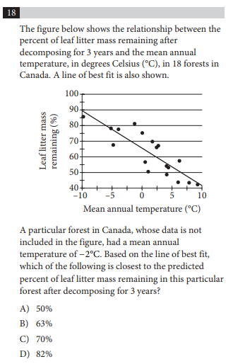
The correct answer here is (C) 70%.
The question states that there is a point, not on the graph, where the mean annual temperature is -2 degrees. And, importantly, the question tells you to look on the line of best fit to figure out where that point would chart. Eyeballing it, 70% is the only one that makes sense.
Lesson
Any time you get a scatterplot chart, make sure you look at whether the question is asking about the line of best fit or the particular points on the chart. This will be critical. A student that may have missed that point may have answered the question as (D) 82% because there is one point on the chart that is at -2 degrees Celsius and it lines up to 82%.
Note, the SAT knows the common mistakes students make and they write questions and give you answer choices in a way that students are likely to miss.
Want more practice questions? Check out the Worthington Prep SAT Tutoring Questions page.